
Typography
This page is a live type specimen – it shows how the theme renders standard content: headings, paragraphs, lists, quotes, tables and code. Resize the window to see the fluid type scale respond.
Headings
Heading one
Heading two
Heading three
Heading four
Heading five
Heading six
Paragraph & inline elements
A paragraph of body text sets the reading baseline. It can carry a link, strong importance, emphasis, inline code, a highlight, subscript and superscript, and stays comfortably readable from a phone up to a wide monitor.
Blockquote
Innovation is saying no to a thousand things. Focus means choosing what truly matters and letting the rest go.
– Design principle
Unordered list
- Clean typographic system with a fluid scale
- Customizer controls for color and fonts
- Accent, text, background and border tokens
- Any Google Font by name
- Full WooCommerce styling out of the box
Ordered list
- Install and activate the theme
- Set your homepage and menus
- Start publishing
Table
| Plan | Best for | Price |
|---|---|---|
| Starter | Personal blogs | $0 |
| Studio | Small teams | $29 |
| Business | Growing shops | $79 |
Preformatted code
.button {
    border-radius: 8px;
    border-width: 2px;
    font-weight: 600;
}
Definition list
Theme
The design layer: layouts, Customizer, WooCommerce styling.
Builder
Optional section-based page builder with 200+ variations.
Buttons
Buttons are the native core/buttons block. The theme styles every button state – pick a style from the block’s Styles panel; no custom classes needed.
Form elements
Forms are embedded with the [ewut_form] shortcode, so the theme styles the inputs, textarea, checkbox and submit button consistently – no raw form markup in the content.
Alerts
Alerts are native core/group blocks with an “Alert: …” block style, tinted with the Ant-Design palette. No custom classes are typed by hand.
Your changes have been saved.
A new version of the theme is available.
Your trial ends in three days.
This action cannot be undone.
Highlight a note in the brand colour.
A quiet, neutral notice.
Image alignments & captions
Body copy flows beside a left-aligned image so you can judge the gutter, the caption spacing and how the fluid type sits next to media. The theme owns the alignment and caption styling, so the same result appears on any page without extra classes.
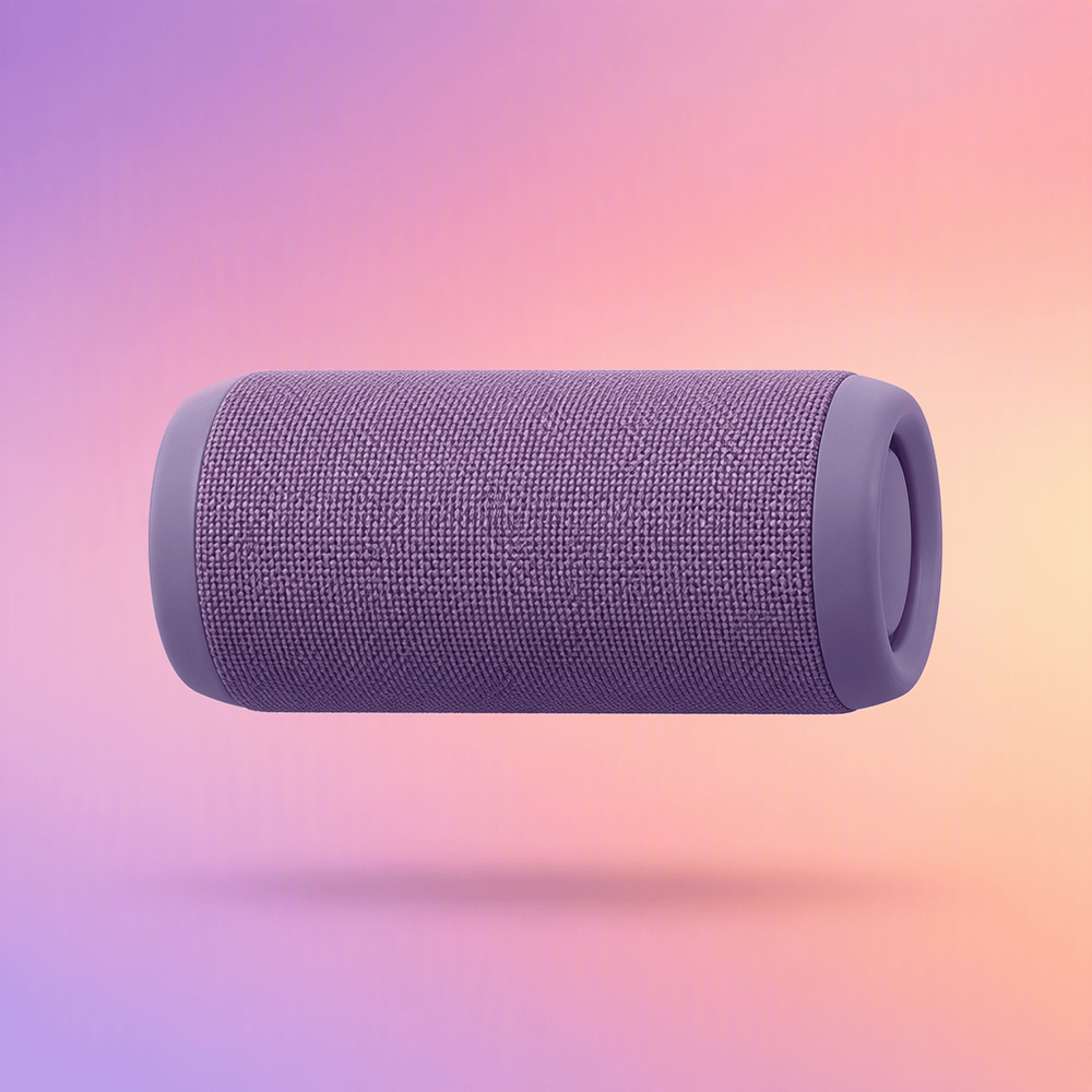
Left-aligned, text wraps around it.
Wrapping is where a reading measure earns its keep. The column beside a 320px image is narrow, and if the type scale were set in fixed pixels the lines would break at awkward places or grow rivers of white space. Here the size and leading come from the same fluid scale as the rest of the article, so the text keeps an even rhythm however wide the screen is.
Captions sit directly under the media and stay narrower than the body text, which keeps them read as a label rather than as another paragraph. The float clears before the next block, so a heading after this one always starts on its own line.
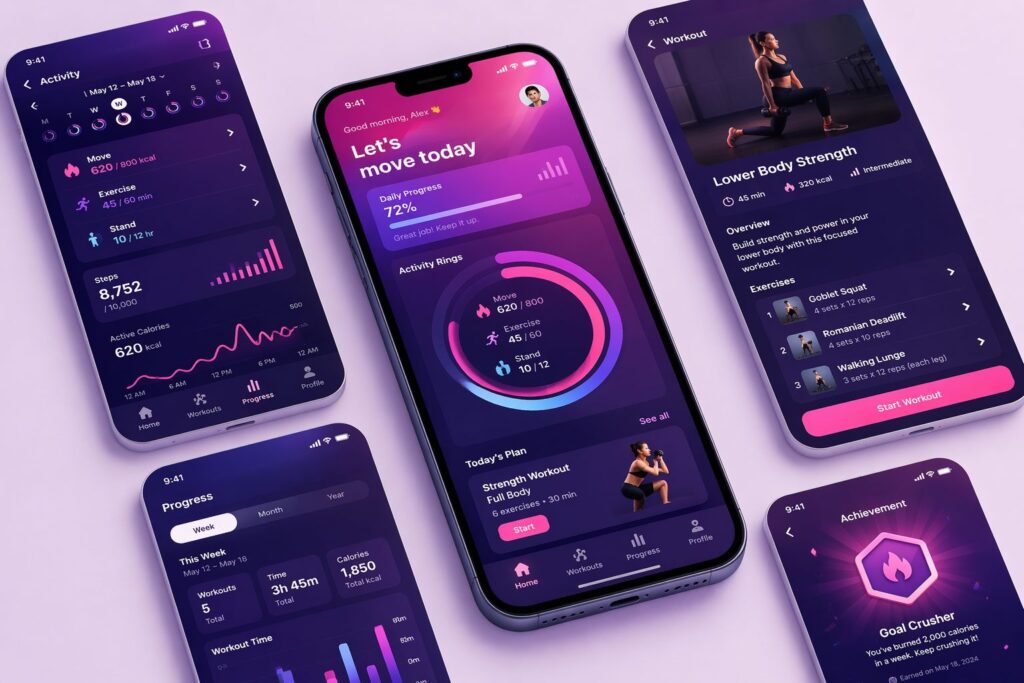
A right-aligned image reverses the arrangement: the text leads and the picture follows it down the page. This suits a portrait or a screenshot that supports the argument being made rather than introducing it.
The gutter is 32px on the text side and nothing on the outer edge, so the figure lines up with the right margin of the column exactly as the left-aligned one lines up with the left. That symmetry is easy to lose and immediately visible when it goes, which is why both variants are shown here side by side.
Below the tablet breakpoint both floats drop their alignment and become full-width blocks in document order. Nothing is hidden and nothing is reordered, so a reader on a phone sees the same sequence of image and explanation.
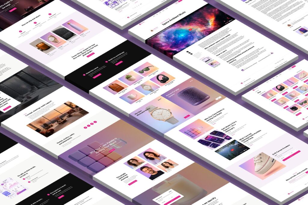
Figure with figcaption
Nested list
- Design layer
- Customizer tokens
- Accent colour
- Type scale
- WooCommerce styling
- Customizer tokens
- Content layer
- Blog and archives
- Typography specimen (this page)
Nested blockquote
A first-level quote sets the outer voice.
Embedded video
Wide table (scrolls on mobile)
| Category | Variations | Editable text | Editable images | Reorder | WooCommerce | Responsive |
|---|---|---|---|---|---|---|
| Navigation | 12 | Yes | Yes | Yes | – | Yes |
| Header / Hero | 18 | Yes | Yes | Yes | – | Yes |
| Features | 32 | Yes | Yes | Yes | – | Yes |
| Commerce | 20 | Yes | Yes | Yes | Yes | Yes |
| Blog | 19 | Yes | Yes | Yes | – | Yes |